What visuals actually make an invention pitch land?
A pitch lands when the listener understands what the thing is before you finish your second sentence. That means the visual has to answer three questions on sight: what does it do, what does it look like, and what makes it different from what already exists.
Most first-time pitches fail this test not because the idea is weak, but because the visual asks the listener to do translation work. A rough sketch with five arrows and a paragraph of labels forces someone to read before they can picture anything. A single clean image, even a simple one, does the picturing for them.
This matters whether you're pitching a friend for feedback, an advisor, or eventually an investor. The visual is doing the same job every time: compressing your idea into something a stranger can hold in their head in under ten seconds.
What's the difference between a sketch, a rendering, and a prototype photo in a pitch?
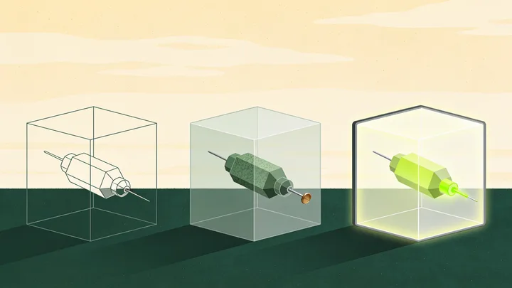
Each one signals a different stage of the idea, and using the wrong one can undersell or oversell where you actually are.
A hand sketch signals "this is a concept." It's honest and fast, and it's genuinely useful early on, but in a pitch it can read as unfinished if it's the only visual you show. If you want to understand what a sketch can and can't do for you at this stage, this breakdown of turning a sketch into a 3D model walks through the gap between the two.
A 3D rendering signals "this is designed," even if nothing has been built yet. It shows proportion, material, and function in a way words can't. A rendering is often the single highest-leverage visual for a pitch because it looks finished without requiring you to have actually manufactured anything.
A prototype photo signals "this exists and works." It's the strongest proof point you can offer, but it's also the most expensive and time-consuming to produce, and it's not always necessary at the pitch stage. If you're weighing whether you need one yet, this look at what a 3D model gives you before you build anything is worth reading before you spend money on physical parts.
How many visuals does a pitch actually need?
More than one, but rarely more than three to five. A useful minimum set looks like this:
- One "hero" image that shows the whole product at a glance, ideally a clean 3D rendering or a well-lit prototype photo.
- One image that shows the mechanism or feature that makes the idea different, often a close-up or a cutaway.
- One image that shows the product in context, being used by a person, to prove it solves a real problem.
Beyond five images, most listeners stop absorbing new information and start skimming. If you have more visuals than that, save them for a follow-up conversation or an appendix, not the pitch itself.
Should you show a 3D model or a physical prototype?
A 3D model is almost always the better first move. It's faster to produce, cheaper to revise, and it lets you show multiple angles or configurations without building anything twice. A physical prototype adds real credibility, but building one before you've validated the idea's shape and function is a common way to spend money you didn't need to spend yet.
Cost is the practical driver here. Prototyping expenses vary widely depending on materials and complexity, and this cost breakdown for invention prototypes is a reasonable place to start if you're trying to decide how far to go before your first pitch. In many cases, a strong rendering carries a pitch just as well as a physical object, especially in the early conversations where you're testing the idea, not closing a deal.
If your invention's value is mostly mechanical (how it moves, how it fits, how it feels in the hand), a physical model will eventually matter more. If its value is mostly about the concept or the market it serves, a rendering can carry you much further than most people expect.
What visuals matter for a patent-related conversation vs. an investor conversation?
These are two different jobs, and conflating them is a common mistake.
For an investor or a general audience, the visual's job is persuasion: does this look real, does it look needed, does it look different. Polish matters. Emotion matters. A lifestyle shot of someone using the product often does more work than a technical diagram.
For a patent-related conversation, the visual's job is precision: does this clearly show the structural feature that might be new. A patent attorney, or a prior art search (the process of checking whether something similar has already been publicly disclosed, in a patent or elsewhere), cares about accurate dimensions and construction, not mood lighting. These two needs sometimes use different images entirely. Whether formal drawings are required at your stage is worth understanding on its own; this piece on drawings for a provisional patent application covers that in plain terms, and it's a good early read before you assume your pitch deck visuals will double as legal documentation. They usually won't, and that's fine, they're not meant to.
One caution worth stating plainly: no visual, however polished, tells you whether an idea is or is not patentable. That determination depends on factors like novelty and prior disclosures, the kind of question a patent attorney would ultimately weigh in on. A compelling pitch image and a patentable invention are two separate things, and it's worth not letting one convince you of the other.
What's a common mistake people make with pitch visuals?
The most common mistake is leading with complexity instead of clarity. People try to show everything the invention can do in one image, cramming in labels, arrows, and callouts, and the result is a visual that requires a tour guide.
A close second is skipping the "in use" shot. Founders often show the object beautifully but never show a human interacting with it, which leaves the listener to imagine the use case themselves. That's an easy gap to close, and it's usually the image that gets the most reaction in the room.
A third mistake is treating visuals as a one-time task. As the idea evolves, and it will, the visuals should evolve with it. A pitch built around an outdated image of the product tends to generate confused follow-up questions that have nothing to do with the actual idea.
How do you sequence visuals in a pitch deck or meeting?
Order matters almost as much as the visuals themselves. A sequence that tends to work:
- Show the problem, in words or a simple image, before showing the solution.
- Show the hero image of the product, uncluttered, for a few seconds of silence.
- Show the feature or mechanism that makes it different.
- Show it in use, with a person, to ground it in a real moment.
- Only then, if relevant, show technical or construction detail.
This order mirrors how people actually process new information: context first, object second, mechanism third, proof last. Reversing it, leading with mechanism or technical detail, is a fast way to lose a room that hasn't yet decided why they should care.
If you're still early enough that you're not sure which features are worth visualizing at all, running the idea through a structured assessment before you invest in imagery can save real time and money. EntreDash's advisory board walks an idea through market, prior art, and financial questions before anyone commits to a rendering or a prototype, and the how it works page explains that process end to end. For a deeper library on drawings, models, and prototypes specifically, the IP Education Center has more detail on each stage.